Apple has chosen some iconic names in the past, like the “iPod” and “iMac.” Apple even managed to take “iPad” — which was widely panned for evoking a feminine hygiene product — and transformed it into the popular lexicon of children and Wall Street analysts alike.
However, Apple does far more than give big and bold names to products — it even names key features. For instance, when Apple introduced a sharp new pixel-dense screen, it did something incredibly smart — it gave the feature a special name — a “Retina” display.
That simple strategy of naming features is important to Apple’s overall success. When you take a closer look, Apple’s product and feature names work together in slick ways, even going so far as to become the new standard by which competitors’ similar features are not only judged, but also understood by regular people.
The Power of Naming
For instance, consider “Touch ID,” which is Apple’s method of using biometrics through fingerprints to provide secure user login and passwords. Apple’s choice in name is both utterly descriptive — touch the button to give your ID — and nonthreatening. Touch is usually a good thing, and most every potential Apple consumer knows what an ID is.
After Apple initially introduced Touch ID with the iPhone 5s, the company transformed Touch ID into a line-item feature, and because Apple did its work initially with the marketing effort of the feature — as well as the intuitive name — Touch ID is now an easy-to-understand feature that requires very little thought for a potential consumer to understand it.
More to the point, instead of not naming Touch ID — perhaps just saying the Apple iPhone 5s now has a built-in fingerprint scanner — Apple is implying that its fingerprint scanner is worthy of a great name, that it is an innovation in and of itself. This little trick becomes even more useful when Apple adds Touch ID to other products.
By naming a feature, Apple ensures that it remains a feature to appreciate and not just a spec in a list of specs.
What about the Retina display? When Apple first introduced Retina, it had to know that other companies would begin talking up their own similar displays. Instead of getting into the kind of megapixel war that plagued the digital camera world for years, Apple stayed aloof of specs like “577ppi” and just let “Retina” do the talking. That is the only word millions upon millions of customers need (or even want) to hear.
Never mind that the glorious screen on the new Samsung Galaxy S6 boasts a 577ppi screen. When I think about a few dozen of my smartphone-using friends and relatives — regular consumers — I don’t think that any of them have any idea what 577ppi means.
As for what Retina display means, I would bet that at least a third have an idea, while another third would associate Retina display with a screen feature that’s worthy of being named. For them, Retina is immediately considered “good” while 577ppi is just confusing.
This byproduct of a great feature name forces competitors to work even harder. All sorts of tech press writers describe better, sharper displays in terms of “Retina,” using it as a baseline standard for excellence. I’m 100 percent confident that Apple knew this would happen — and it happens with Touch ID, too.
As a tech writer, I know that it’s just too easy to compare someone else’s biometric login system to Touch ID in both news and reviews.
What’s worse is that some competitors end up doing the same thing: How would you like to be the guy whose best shot at selling your product is using your competitor to describe it — if not define it?
For instance, consider “Our tissue is better than Kleenex…” or “Our bandages are better than Band-Aids.”
Apple is not only using the power of naming to help it market its own products to its own customers, but it’s pulling a Kleenex and Band-Aid equivalent on all sorts of consumer technologies.
Samsung’s Lost Edge
When Apple recently introduced a new MacBook, it not only talked up the technology behind the new trackpad, but also named the technology behind it: “Force Touch.” Seems intuitive, doesn’t it? The name has power — it defines it, just like Touch ID, as well as describes it. And because it has a name, it must be important, right? There is psychological power in names, and Apple is keenly aware of that.
At Apple, even a new user interface action received its own descriptive name: “Force Click.”
What about the vibrating haptics going on underneath the new Force Touch trackpad? It’s powered by Apple’s “Taptic Engine,” which debuted last year when the Apple Watch was announced.
What the heck is a Taptic Engine? Most people don’t know what haptics is because the name itself doesn’t lend any clues, but Taptic Engine? All you have to do is make the connection between the “tap” in Taptic to head down the path of enlightenment. Taptic, like Retina — which makes an English-speaking person think of an eye — has a core element of its name that signifies the intended meaning.
This is pure brilliance, and Apple has woven its naming strategy throughout its marketing and sales efforts.
For a long time, Apple has been proud of the internally constructed elegance of its products, for instance. You’ll find no stray tape or glue or globs of anything on the inside of a MacBook. Apple shows off the internals as if it were a car salesman lifting up the hood to show off the engine — as if most car buyers had any idea what they were looking at.
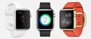
When Apple introduced the Apple Watch, it showed off the inside of its Apple Watch on its marketing splash pages, with a section showing a rectangle of nothing… except that innocuous rectangle was the Apple Taptic Engine.
There’s more going on with the Apple Watch, though. Consider Apple’s “Digital Crown.” It’s a small thing, right, but incredibly powerful. How many people could even tell you what the “crown” of a watch was before the Apple Watch? Now it’s a feature that will connect the traditional past of a watch with the future of digital wearables.
Even using the Apple Watch gets a dose of Apple naming power — “Glances.” As Apple put it, “We optimized your favorite apps for the wrist by developing Glances — scannable summaries of the information you seek out most frequently. To see them, you simply swipe up from your watch face.”
Wow. Except even this name is doing double-duty: Glances implies a “use case” for the Apple Watch. Why buy an Apple Watch? Because you can see important information in a quick glance, from your wrist, which seems sort of cool, right?
Contrast this to the new Samsung Galaxy S6 edge. Some of the initial tech press reactions — from Android lovers and Samsung aficionados — seem to appreciate the edge glass and how it can be used for alerts and user interface shortcuts… but they aren’t quite sure how to easily explain what it is or why it exists. This isn’t their fault. In fact, many of them aren’t sure if it’s important or just some sort of tech spaghetti thrown on the wall that only true pasta lovers will actually want.
If the “edge” on the Samsung Galaxy S6 edge is a premium feature, how is it premium again?
The best thing about the edge is that it can be used with your favorite contacts. I could find some uses for more instant access to my most-used contacts. Maybe it could be called a “Contact Edge.” But what if developers might be able to use the Contact Edge for future apps that wouldn’t have anything to do contacts? Damn. Maybe that would be a bad name. Or maybe not. What I wonder is this: Did it even occur to Samsung to name it at all?


