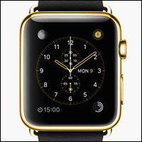
While Apple is known for fantastic product design, it’s not known for customization. For instance, the first iPhone hit the world nearly eight years ago, and yet our “customizable” home screen options are limited to the organization of app icons and some wallpaper choices that can produce color tints through translucent layers.
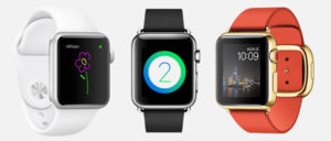
With this in mind, all of us future Apple Watch owners likely will have to settle for a handful of Apple-developed watch faces. I’ve been curious about this for months, hoping that Apple would let third-party designers rethink how to show time through watch faces. My concern was that Apple simply would not allow custom watch faces. Now Daring Fireball’s longtime Apple watcher John Gruber has showered all sorts of cold water over the notion of custom faces.
Dashed Hopes
After taking a look at numerous watch faces available for Android Wear — as well as thinking through the issue, certainly — Gruber reached the conclusion that Apple will not allow rampant development of third-party watch faces for Apple Watch. However, he does think Apple eventually will increase personalization options, design a few more watch faces of its own, and perhaps even work with specific designers to create some new ones.
In the meantime, the watch face will be off-limits to developers, Gruber believes, because Apple considers it part of the Apple Watch system — like the iPhone lock and home screen is core to iOS.
Damn.
Problem is, I had been holding out a glimmer of hope that Apple might open things up — but now I have little hope, because I think Gruber’s right.
More to the point, I have a sneaking suspicion that Apple’s draconian take on customization actually results in better sales and higher customer satisfaction rates.
If that’s true, well, damn all over again.
Less Customization, More Sales?
Conventional logic would dictate that consumers want to customize their smartphone experiences, as well as their Apple Watch experience. After all, they understand that the interface isn’t forged out steel. It’s software. It displays with pixels and light and therefore is malleable in a way that other devices — and watches — are not.
It just makes sense that you ought to be able to customize the interface — at the very least, the watch face itself. Of course, you can customize all sorts of stuff with Android Wear and Android on smartphones. But Apple? Not so much.
However, not giving consumers what they think they want might very well be one of Apple’s most masterful decisions. Ironic, I know. So how might this work out for Apple?
For starters, Apple can almost guarantee that Apple Watch “first impressions” are controlled. I don’t know about you, but there’ve been a few times I’ve borrowed someone else’s heavily customized Android-based smartphone, and the garish choices had me reconsidering the taste — if not sanity — of the owner. The same has gone for some of the jailbroken iPhones buddies have shown off. Customization can result in some things that are insanely ugly.
Still, that’s the point of customization — what I find nasty someone else finds pleasing. Humans, you know. Think different, right?
Except Apple tightly controls and manages the user experience. A simple and relatively neutral UI won’t accidentally generate a sense of revulsion, so that over the long haul — delivered across the world through many different cultures — a relatively simple and slowly evolving UI actually might help Apple sell more devices.
The Apple Watch is in a more delicate place in time right now. With so many people unsure if they even want a smartwatch at all, some unfavorable first impressions through non-glorious Apple Watch faces actually could do some grassroots marketing damage to Apple.
So, first impressions of devices out in the wild might be more important than most of us realize.
Confusion Reduction
Aside from first impressions, the ability to control core user interfaces results in a consistent usability across devices and owners. Right now, I can take a grandfather’s iPhone and easily make adjustments to settings and apps. If I pick up a teenage girl’s iPhone — perhaps with some garish wallpaper and a horrible case, maybe with some sort of sticker on the home button — I’ll grimace but still be able to figure out my way around to troubleshoot a setting.
This consistency must help Apple Store Geniuses troubleshoot problems faster, too, likely resulting in better customer satisfaction.
In addition to confusion reduction, forcing a consistent way of interacting with a device aids in end user training, which may have something to do with some of the data that has shown, for example, that the iPhone has tended to enjoy higher usage rates among smartphones than the competition.
Increased Familiarity
Remember when Apple introduced the iPod with white headphones? Those white headphones became a clear indicator of an Apple product. With only a small awareness of Apple, many people came to recognize a signifier of Apple. Awesome branding. As it stands right now, multiple types of iPhones can wear shape-hiding cases… but anyone who knows iOS can recognize iOS with just a glance.
So maybe customization isn’t so much about mucking up Jony Ive’s hard work. Maybe it has nothing to do with the nagging feeling that Apple’s design acumen flirts with an arrogance that simply refuses to consider that customization is a worthy design feature.
No, maybe Apple’s lackluster customization options are the product of a well-thought-out business decision designed to drive more sales.











There is such a thing as too many options. Throwing a bunch of options out there is way to avoid having to study or think about how to complete the task of delivering a finished product.
Many people enjoy some level of customization, but don’t want to spend too much time diving into the guts of a device–so for those many, it doesn’t really take much to create a sense (illusion?) of uniqueness, of being different. And for those that do spend more time in customization, from what I have been able to observe, oftentimes the result is simply change for the sake of change, not for improvement ("eye of the beholder" considerations notwithstanding).
So it seems to me the "different" part of "think different" is actually the effort that goes into the "think" part.