Google users have been muddling through a design change the search engine giant sprung on them without warning on Thursday, trying to navigate how to customize the page — or revert back to the old look — without having to sign in. (Short answer: It appears you could not.)
Although Google now seems to have restored its classic look as the default, that was not the case Thursday morning, when users logged on to find that its well-known sparse, white interface — punctuated only with a few links to Google’s email, search and news offerings, and of course the daily doodle — was missing. Instead, there was a full-screen photo image with a link on the lower left of the page to navigate to more options, including several striking photo images or solid color blocks. Photos saved on the desktop or in a user’s Picasa photo album could be uploaded as well.

Users who didn’t like the change, Google soothed in a blog post, could easily toggle back to the old look.
However, it was not immediately apparent, at least during the morning hours, that users might have to sign in or register for a Google account in order to switch back. Later in the day, at least via some Web browsers, the lower left-hand prompt brought back the old look back — minus the doodle, though.
It now seems clear that only signed-in Google account holders can navigate these customization changes — an issue for some people, who may use Google search at work but don’t want to sign into their personal account on an office computer.
Strong Feelings
Viewers seem to either love or hate the new look.
Count Terri Slater, president of Healthy Lifestyle Publicity, among the latter.
“I am on Google a gazillion times a day and was shocked at the drastic 360 they took with the new background pages,” she told TechNewsWorld. “Do not like at all. No reason for it as far as I can see. [It is] distracting and of no value.”
By contrast, Andrew Fingerman, VP of marketing for PhotoShelter, likes the change. Given where he works, it’s natural for him to prefer photographic images to white space, he told TechNewsWorld. “Also, we manage the websites of some 60,000 photographers, and I am glad to see Google emphasize this medium.”
Amid the differing opinions on the new option, there is one universal reaction to the change: Why?
Copying Bing?
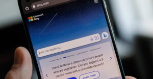
One possibility is that Google wants to look more like Bing, which also features photos on its front page. That explanation, though, is hard to swallow: Google is still — by a wide margin — the leading search engine, and it has no competitive need to protect its flank from Bing.
Also, what Google had was working, Paula Selvidge, VP of PerfectForms, told TechNewsWorld. The sparse front page was its brand — and the doodles forged an emotional connection with many users.
“I really think Google underestimates how much people look to the doodles,” she remarked. The recent Pac-Man doodle commemorating the game’s anniversary inspired walks down memory lane in her office.
The Topeka doodle on April Fools’ Day was a “classic,” continued Selvidge, who is a Kansas native, prompting many joke emails from friends.
Google’s reasoning may be that more customization options will make the page even stickier for its users, she guessed — “but I think this is an error.”
Front Door
The new images are in line with the growing trend of sites using digital photography and striking images to draw readers in — especially as more and more content comes before them, said Fingerman, who approves of the change.
“There is a constant bombardment of content for most people, and the battle for attention is greater than ever,” he said.
Another reason Google may have implemented this option is that it will encourage users to enter Google through the front page, suggested Fingerman. “Right now there are so many widgets or other options to access search. This might give people a reason to navigate to the URL.”


