Steve Jobs’ Apple displayed a rather fascinating balance between design and utility. Granted, it often shifted more toward the design side, which resulted in problems like Antennagate, but that tended to happen when Jobs wasn’t around. He made sure the products worked well and looked good — he understood the need to do both.
After Jobs left Apple in the 1980s, there were clearly changes to Apple’s products. However, it wasn’t until Windows 95 launched that folks actually seemed to look at Apple very differently, and not particularly favorably.
By any financial measure, Tim Cook has been doing a great job — but traditional CEOs tend to work tactically, sacrificing the future to hit ever-higher present heights until what becomes an increasingly fragile house of cards comes crashing down.
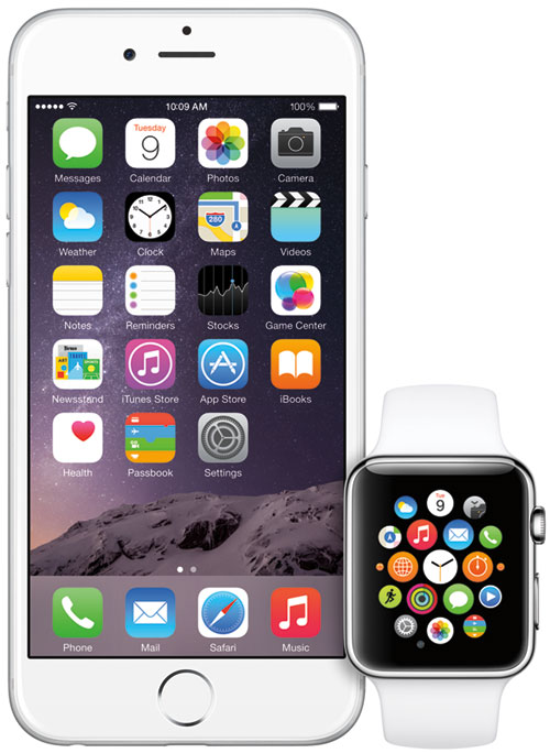
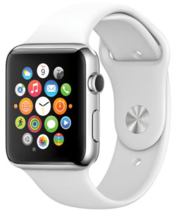
Here’s a look at what the beautiful Apple Watch and the sexy new MacBook can tell us about whether Cook is moving strategically — like Jobs did — or more in line with other Apple CEOs, who eventually failed.
I’ll close with my product of the week — what is suddenly a much better deal in smartwatches: the Fitbit Surge.
The Apple Watch
Apple has been successful largely by bringing out new standalone products that work in a diverse ecosystem. The iPod didn’t take off until it interoperated with Windows PCs, and both the iPhone and the iPad interoperated not only with Windows PCs, but also with a massive number of non-Apple Web servers, including Amazon Prime and Netflix.
The Apple Watch harkens back to the iPod in that it initially works only with iPhones. (The first iPod worked only with Macs and didn’t sell that well). What that means is that unlike the other products, it isn’t an ideal way to bring new customers into the Apple family. They’d have to buy both the iPhone and the Apple Watch to get there. That is a significant cost barrier to entry.
Part of the attraction of the iPod, iPhone and iPad has been that they give status to the user. Like those who drive premium cars, people who bring out an Apple product are seen more favorably, because Apple’s brand is connected to quality products and experiences that it is assumed smart people want to buy.
However, the Apple Watch carries risks. We aren’t used to seeing people talk to their wrists, and we’re even less used to seeing people alternate between talking to their wrist and holding their watch to their ears, as they might have to in an environment with excessive noise (like a bar, airport or business conference).
In addition, we’ve seen people struggle to get their phones to work with boarding passes and airport scanners, shrinking or expanding the image while the TSA or airline employee messes with the phone. Now imagine what this is going to look like on a wrist, with all of the people behind them in line getting increasingly annoyed and vocal.
Finally, let’s take the US$10K Apple Watch. Unlike a Rolex or other watch in this price range, this is still a tethered iPod mini on your wrist. It’ll largely be obsolete in 12-24 months. I think the folks who pay that kind of money are going to look pretty foolish in that future time frame, even though I doubt they will see it coming this year in their rush to buy an exclusive new Apple product. The funny thing about rich people is that most get there by not making foolish choices — and this one looks really foolish.
Strangely, the cheapest Apple Watch appears to be the one that gives you the best value. Its price is more in line with other smartwatches, making it the smartest version. The lowest-cost option is also the most like the very focused iPod, which first showcased Apple’s newfound success around this time last decade. When the smartest/best product in a luxury line is also the cheapest, that’s good for you — but typically not so good for the vendor or the brand.
The New MacBook
Apple’s new MacBook, using an Intel Core M processor, is amazingly thin and light — but to get there, the designers had to make some compromises. The keyboard is a short throw keyboard — better than a screen keyboard or membrane keyboard, but lacking the feel of the keyboards most laptop users currently prefer.

The bigger problem is that to get to this extreme thinness, the designers had to make performance sacrifices to prevent overheating — like they did with the original MacBook Air — suggesting they’ll have to throttle the processor aggressively. In the first place, the Core M isn’t a performance part from Intel by any stretch of the imagination, at least not when compared to the Core i5 or Core i7. That was something users complained about in the original Air — that it was slow — and it should be a problem in the new MacBook as well.
Thinness also increases the product’s bending/breaking risk. HP, Toshiba and Sony all have tried to market products in this extra-thin class, and the market has rejected them as too compromised. Actually, the first was HP, with the HP Sojourn, which drew crowds because it was so thin, but it sold very poorly because it made too many compromises.
Now Apple can do what these others didn’t and drive people more successfully to a new ultra-thin product, but if users don’t like working on the product or it breaks excessively, they may abandon Apple altogether. Others, seeing these early users struggle, will be more likely to avoid the brand.
You really don’t want to be one of the first buyers of this new laptop without using the keyboard first.
Wrapping Up
Apple is losing track of the balance between design and utility. The Apple Watch feels like a three-version product — like the iPod and the iPhone were — that requires three versions before really hitting the market sweet spot.
In both cases, that was due in part to the market not knowing at first what it wanted. The MacBook really feels like a repeat of earlier Apple mistakes like the Apple TAM (designed by Jony Ive and hated by Steve Jobs). Design got ahead of price, and it didn’t sell. Let’s hope that isn’t the path Apple is now on.
In the meantime, before you buy the new MacBook, make sure you touch the keyboard and can live with the compromises — it is better than a screen keyboard on a tablet. As for the Apple Watch, the smartest version is likely the cheapest, because it represents the least financial risk and also is the most focused and thus the most Apple-like. The third version of the watch should be the best balance of capability and price.
What does this tell us about the new Apple? It is increasingly looking like the Apple when Jobs wasn’t there — though clearly still massively powerful and successful in the market. However, if folks start to see Apple differently, a lot of things — most of them not good — will start to happen very quickly.
Product of the Week: Fitbit Surge

Suddenly, the most expensive Fitbit smartwatch looks like a real value. I’ve been using the Fitbit Surge for some time, and it is a decent watch, pedometer, GPS and heart rate monitor. It shows texts, and you can control your music from the phone. It feeds through iOS or Android, and it uses a dongle to wirelessly feed through your PC to the Fitbit Web app, which allows you to compete or measure yourself against your friends who also have Fitbits.

The app connects to Fitbit’s Smart Scale, and the Surge automatically will measure and report the quality of your sleep. I’ve been getting about five days of battery life from this product, and while it won’t run apps, I do have my phone for that.
At $249, it is far less expensive than the lowest-cost Apple Watch, and it is actually pretty mature. In short, the Fitbit Surge gets you most of the stuff you’ll likely want in a smartwatch today for a fraction of the cost of an Apple Watch, and it will work with both iOS and Android.
Strangely, the Fitbit Surge reminds me more of the original iPod concept then any high-profile Apple product currently in the market. It does a few things well and doesn’t try to be everything to everyone.
Interestingly, I bought it for my wife — and even though it is smaller than the Apple Watch, it was too big for her, so she uses the much smaller Fitbit Charge. For the money, I think the Fitbit Surge is just a better deal — and since it’s what I’m using, it’s my product of the week.




















My respect for TECHNEWSWORLD has evaporated. Rob Enderle? Really? This is the one person (I won’t call him an analyst, since he analyzes nothing) who has been the most consistently, completely wrong about Apple for the last two decades. Enderle’s errors are so laughable they could make a great comic movie. Let’s call it "Dumb, Dumber and Dumbest."
Enderle predicted the failure of all the following: iPod, iPhone, iTunes, several Apple laptops, the move to intel chips, the iPad, the Mac Pro, etc., etc. I’m not sure what negatives he may have tried to sneak into this writing. I couldn’t force myself to read it all. Fortunately, all the predictions of Apple’s demise offered by Enderle are preserved for eternity for all to get a chuckle out of. Search and you shall find. I’ve read them, mostly, just for a laugh. But they’re not worth looking up to read again, once you’ve enjoyed the joke. The farther away you get from Enderle’s former writings, the more glaringly wrong they appear as Apple continues to succeed beyond all imagination.
Well since you didn’t read it I’ll fill you in. He didn’t even make it one paragraph before recommending another product which he wrote about at the end of the article. That product in all its greatest looks like a cheap plastic Casio in a supermarket cabinet. So he’s spot on as usual.